Making one brand identity hold across 40+ markets.
Design lead on Nespresso's worldwide digital rebrand, from the online store to the machine on the counter.
Book the 45-min Diagnostic
problem.
01Nespresso's brand was rich offline and thin online. In the client's own account, five years earlier the eCommerce content was basic next to the stories the brand told everywhere else. At the same time only a fifth of coffee machines were sold through direct channels, the capsule range grew every year while most customers stayed on the classics, and each of more than forty markets was rendering the brand its own way.
The cost was a premium brand that did not read as premium at the point of sale, and an online store that could not do the job a boutique assistant does.
work.
02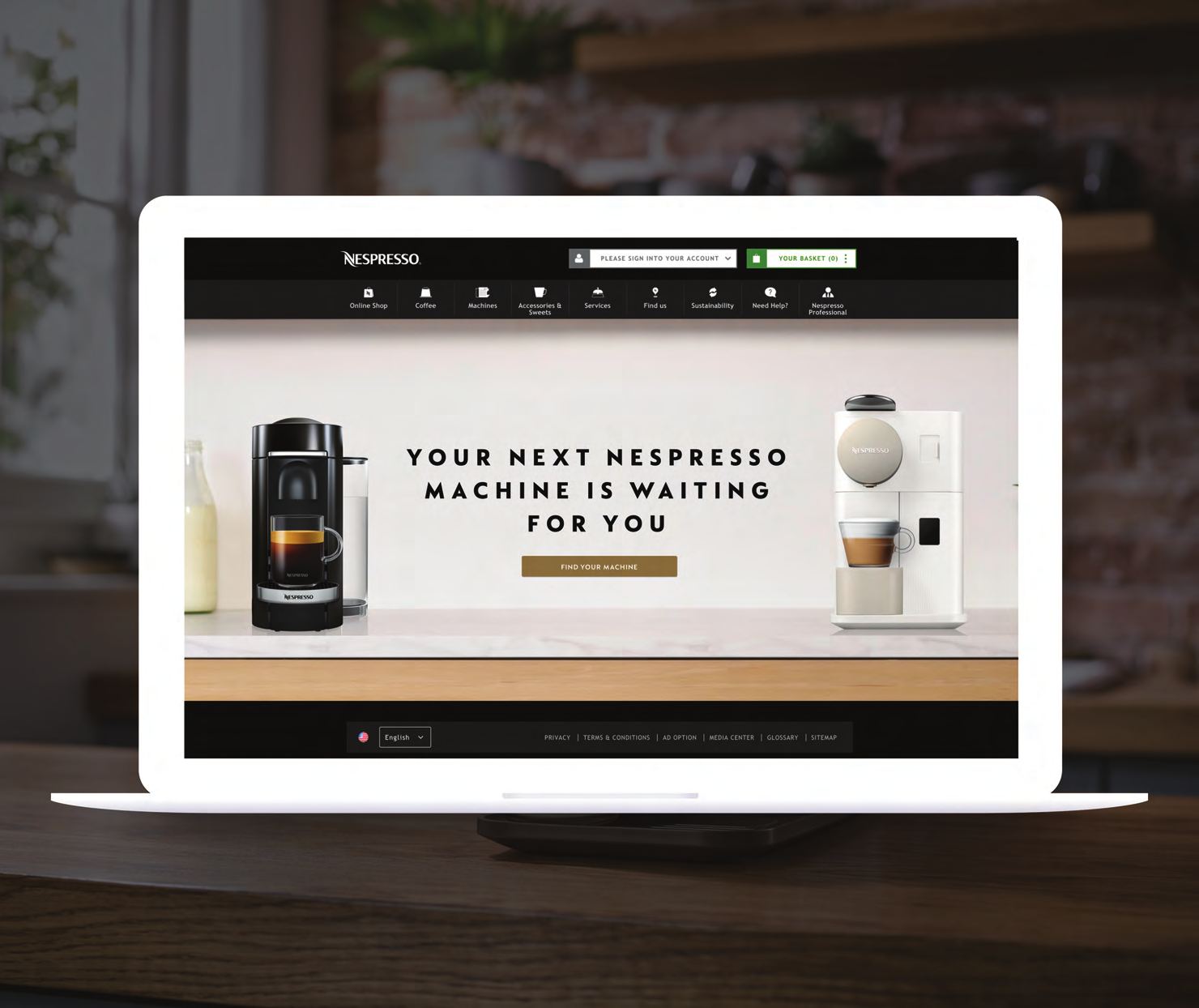
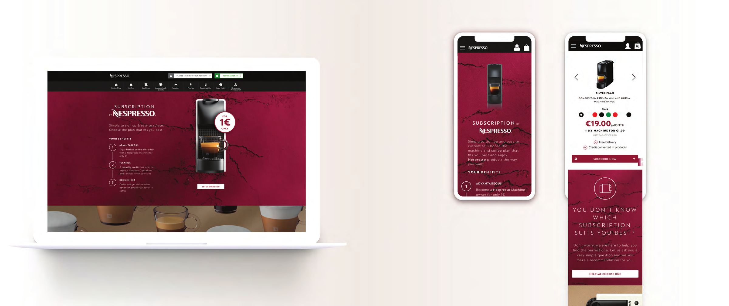
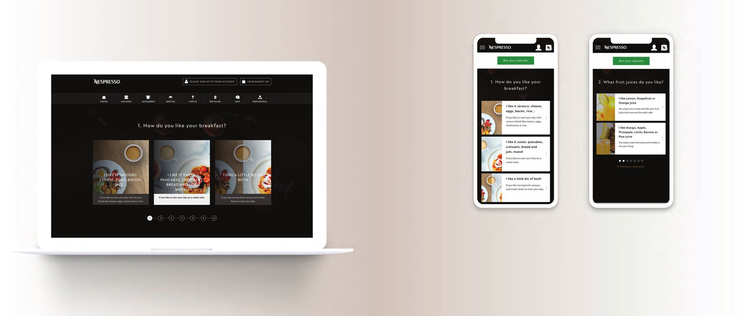
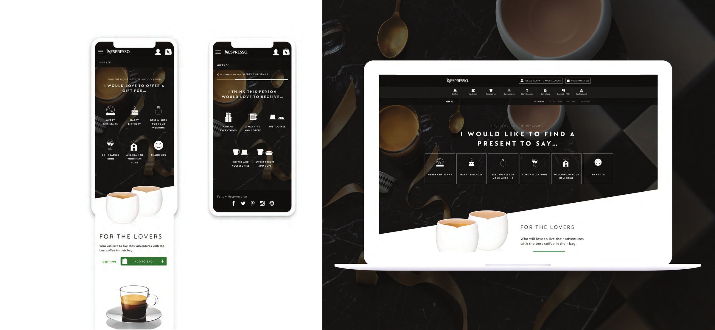
Guided choice, not catalogue. Two tools carried most of the discovery load.
The same content model, run against a different buyer.
Here is how we got there.
approach.
03The identity had to survive forty markets
A guideline document does not survive forty markets. A system with governance does. So the rebrand landed as three things rather than one: digital guidelines, a design system behind them, and a global governance layer that let local teams ship without the identity drifting. Consistency stopped being something the centre asked for and became something the system produced.
Content had to sell the way a boutique does
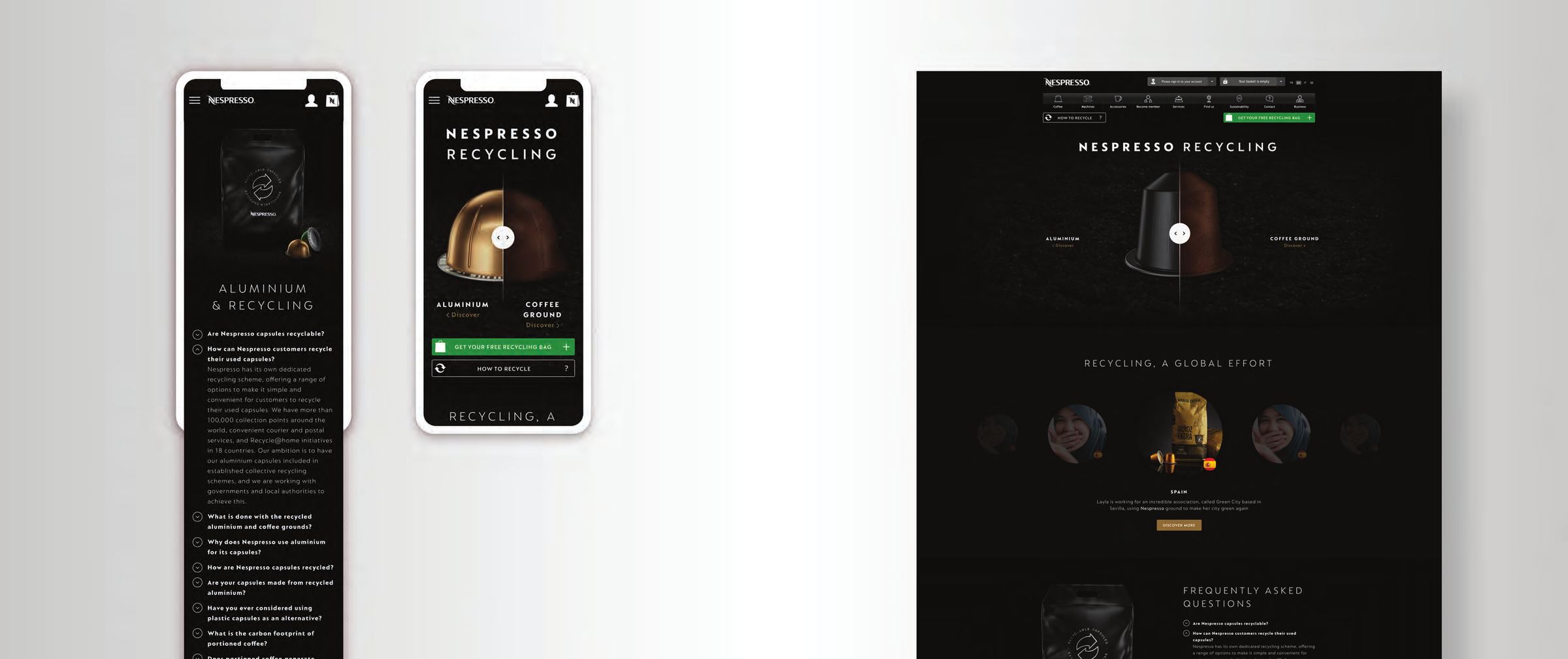
The unit of work was the journey, not the page. Every project in the programme started from a sentence a customer would actually say, "I would like to buy a machine", "I would like to buy some coffee", "I would like to know how to recycle", and was answered in the same three parts: the context, the objective, the solution. That frame is why it scaled. A new range or a new market was filled in rather than redesigned.
The pages that worked hardest were the ones that did a person's job. The machine finder and the Coffee Selector both ask a few questions and come back with a recommendation, which is what a boutique assistant does and what a product grid does not. In 2018 the Coffee Selector moved coffee mixity by 15 percent and conversion to orders by 10 percent against the previous year.
The same system had to work for a purchasing manager
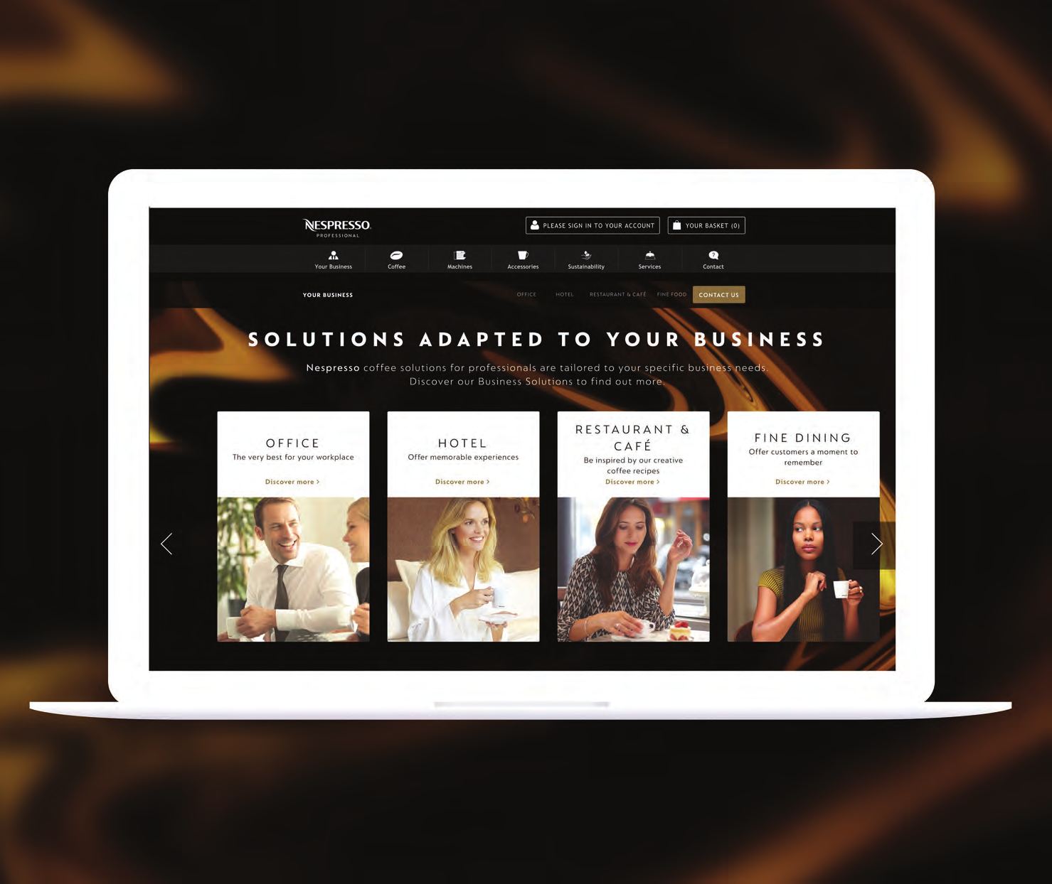
Nespresso Professional ran the model against a different buyer: office, hotel, restaurant and café, fine dining. Each got a channel-focused landing page, so a prospect saw their own business reflected before they saw a machine. The reasoning was blunt. By the client's own research, 94 percent of B2B buyers research online before they buy, which meant the first interaction had to clear a bar the offline experience had already set.
craft.
04Two coffee systems, one navigation
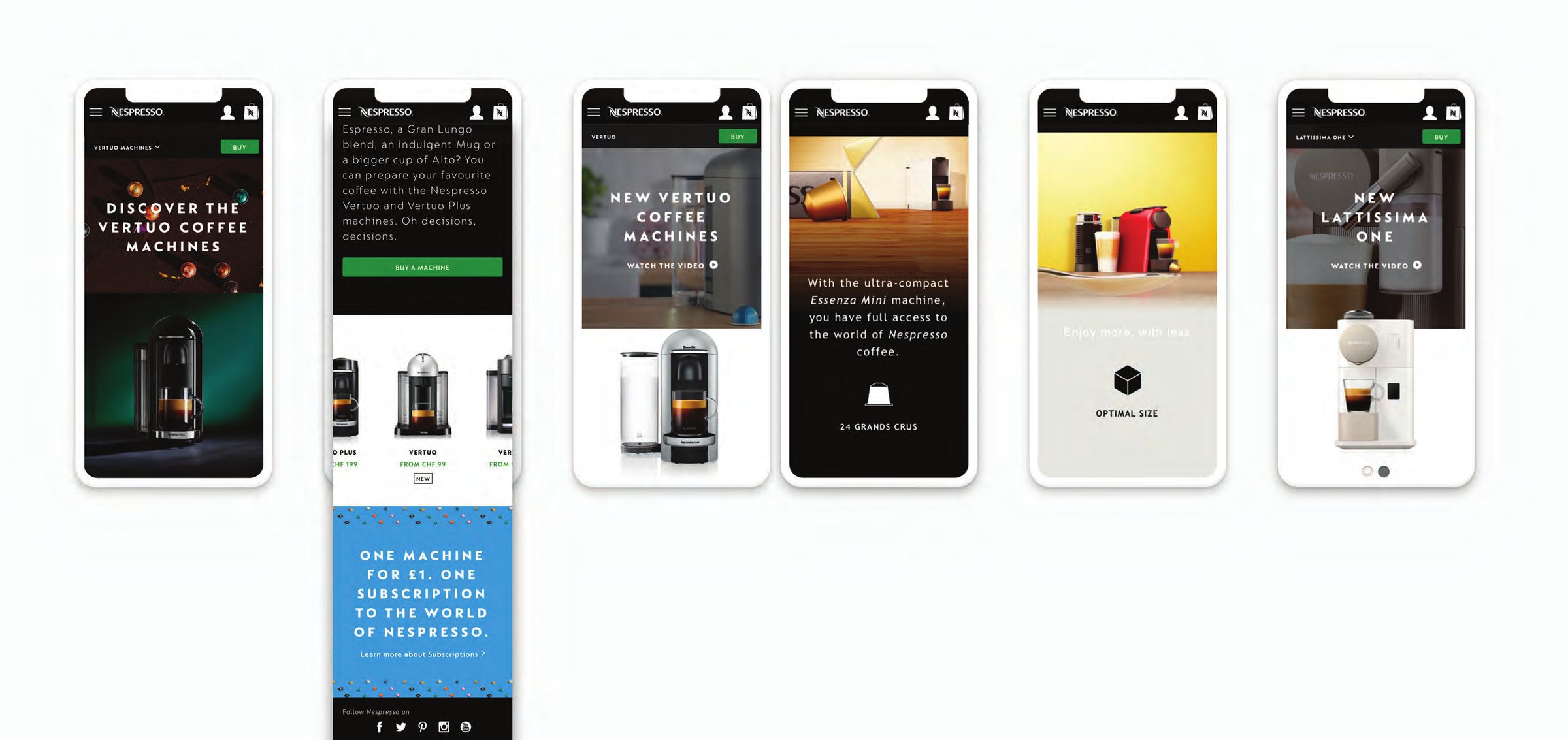
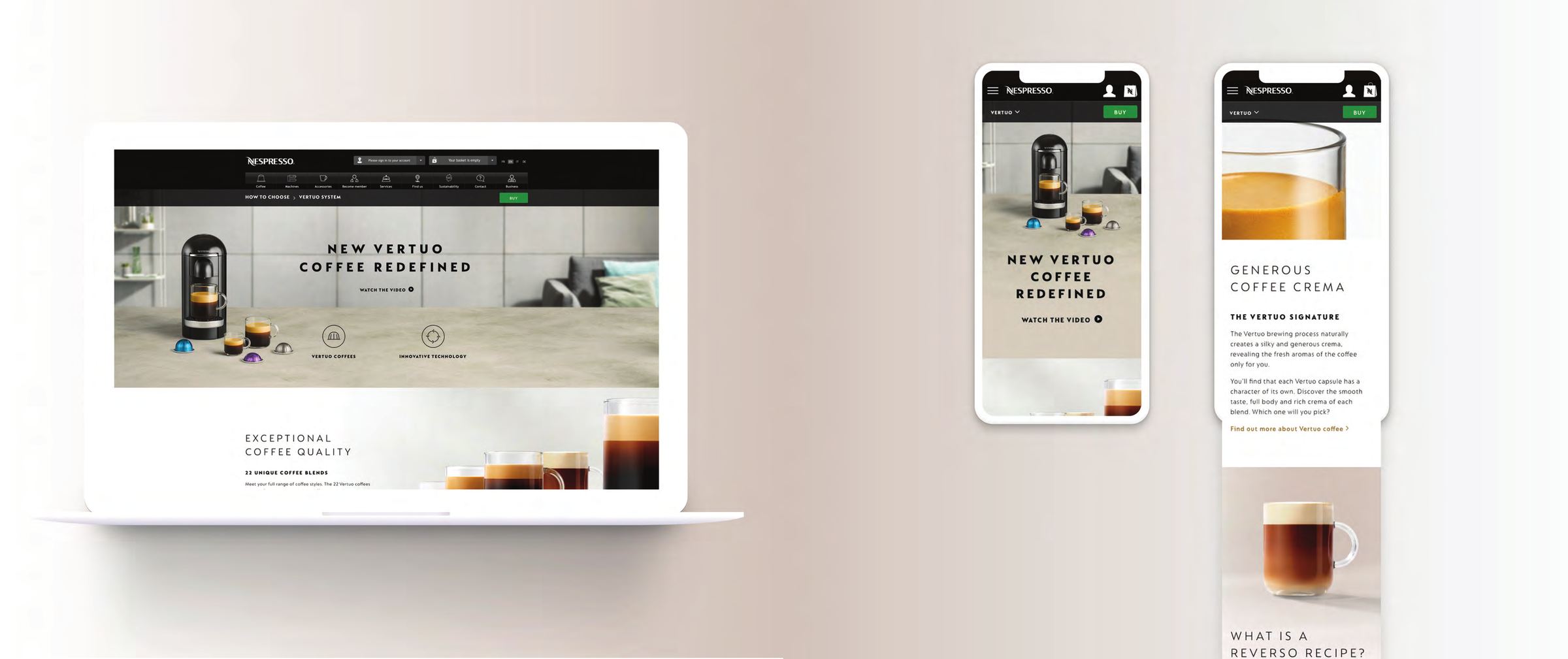
Original and Vertuo are different machines, different capsules, different cup sizes. Left alone, Vertuo would have read as the exception, the thing bolted on beside the real range. The pages were built to mirror instead: same structure, same depth, same comparison criteria on both sides, with the difference between the systems explained rather than smoothed over. Thirteen new pages.
The deck records those pages as converting higher than the product pages sitting beside them in FY2018, with coffee at 23.9 percent, machines at 3.5 percent and accessories at 32 percent.
impact.
05These are Nespresso's numbers, recorded in Nespresso's voice. The deck does not split results by contributor, so they are given here at the scope they were measured.
Programme level, across the eCommerce content team
Project level
- Coffee Selector
- Coffee mixity +15 percent, conversion to orders +10 percent, both against the previous year in 2018.
- Accessories content
- 53 percent of visitors went on into the site from the accessories content page, with accessories conversion at 69.5 percent, up 22.5 percent on the previous year.
- Recycling
- The awareness work is recorded alongside 23 percent of customers recycling.
- Black Friday
- Logged internally as the highest traffic and conversion rate in Nespresso eCommerce history at that point.
What is mine in that list is the system and the pages, not the figures standing on their own.
learning.
06What made the work scale was not the pages, it was the frame underneath them. Every project started from a customer's own sentence and got answered in the same three parts, so the next one was filled in rather than reinvented. Governance turned out to be a design deliverable rather than an afterthought: without it the identity would have drifted inside the first ten markets. And the pages that performed best were the ones that behaved like a person, asking a few questions and coming back with an answer, instead of presenting a catalogue and waiting.
Next project — yours?
One conversation is usually enough to know whether I can help.